")
7 Trending Kitchen Respray Colour Ideas for UK Homes
Over 80 percent of British homeowners say kitchen colour is their top style priority, shaping daily mood and comfort. With kitchens as the heart of the home, choosing the right palette has never been more important for those craving both timeless elegance and personal flair. Whether you love soft neutrals, bold blues, or contemporary finishes, this guide highlights the latest trends to help every British home create a kitchen that blends lasting beauty with modern sophistication.
Table of Contents
- 1. Embracing Soft Neutrals For Timeless Style
- 2. Choosing Bold Blues To Make A Statement
- 3. Incorporating Green Shades For A Fresh Look
- 4. Opting For Warm Greys To Add Subtle Warmth
- 5. Utilising Two-Tone Cabinets For Contrast
- 6. Selecting Matt Finishes For A Sleek Appearance
- 7. Matching Colours With Worktops And Tiles
Quick Summary
| Key Message | Explanation |
|---|---|
| 1. Soft Neutrals Offer Timeless Elegance | Muted tones like warm greens and mushroom greys create a calming backdrop, allowing flexibility in design while ensuring sophistication. |
| 2. Bold Blues Add Impactful Statements | Deep blues like sapphire navy instil confidence and create visual depth, making spaces feel larger and more dynamic. |
| 3. Incorporating Green Connects to Nature | Warm olive and natural greens create calm, inviting spaces, linking your kitchen interior to the serenity of the outdoors. |
| 4. Two-Tone Cabinets Enhance Visual Depth | Pairing light and dark tones allows for functional zoning within kitchens, adding sophistication and layout clarity. |
| 5. Matt Finishes For A Sleek, Modern Look | Matt surfaces absorb light to create warmth and elegance, offering a contemporary aesthetic that enhances overall design. |
1. Embracing Soft Neutrals for Timeless Style
Soft neutrals are the secret weapon for creating a kitchen that feels both contemporary and enduringly elegant. According to recent kitchen colour trends, muted tones like mushroom, warm greens, and subtle earth tones are transforming kitchen aesthetics by offering sophisticated personal expression.
These understated colours provide remarkable versatility, allowing you to craft a space that feels simultaneously modern and classic. Neutral palettes create a calm, harmonious backdrop that can effortlessly adapt to changing design preferences without requiring a complete kitchen overhaul.
When selecting soft neutrals, focus on warm undertones that create depth and character. Think mushroom greys with subtle brown hints, sage greens that whisper rather than shout, and gentle terracotta tones that add warmth without overwhelming the space. These colours work harmoniously with wooden textures, metallic accents, and various worktop materials.
To implement this trend, consider a kitchen respray using colours like soft sage, warm mushroom, or subdued reddish brown. These shades not only look sophisticated but also help create a grounded, inviting atmosphere that feels timeless and personal.
Practical application is straightforward: choose neutrals with subtle warmth, test colour samples in your specific lighting, and commit to a palette that reflects your unique style while maintaining broad appeal. Your kitchen will thank you with an elegance that transcends passing trends.
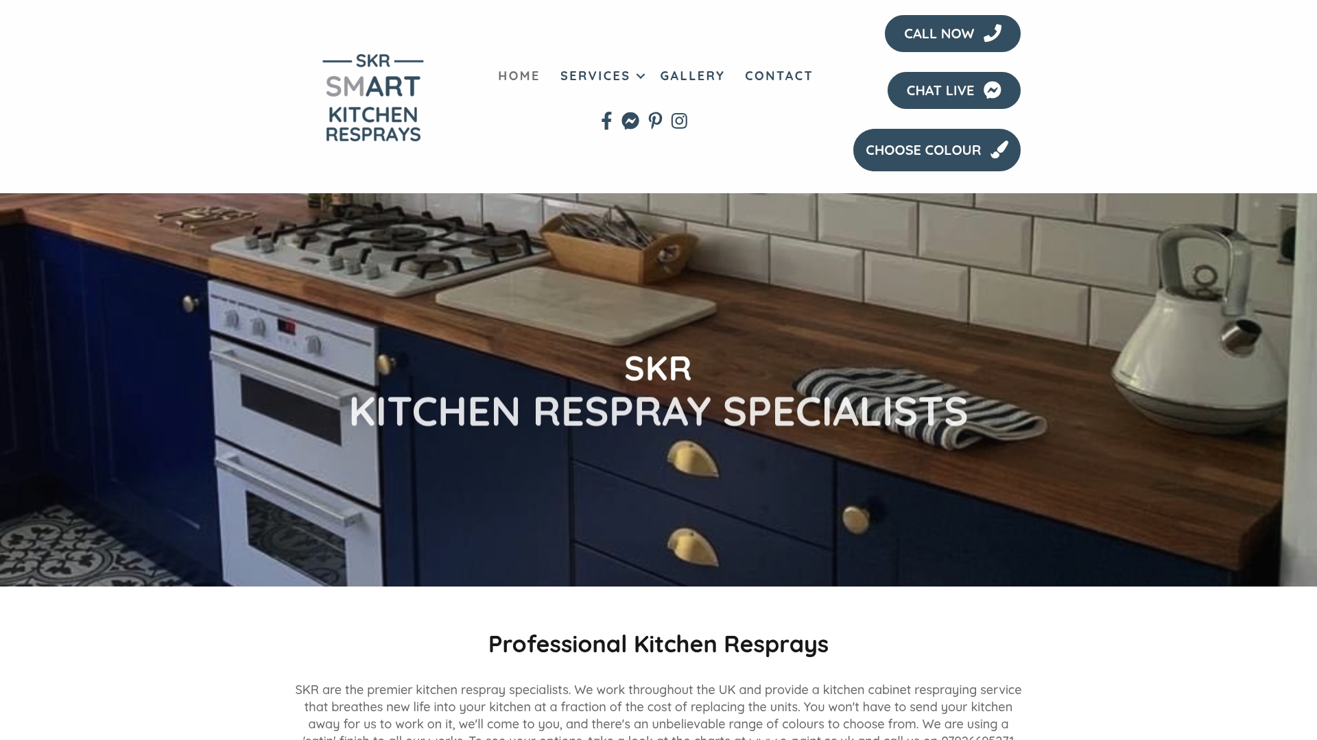
2. Choosing Bold Blues to Make a Statement
When it comes to kitchen design, bold blue tones are emerging as a powerful statement colour that transforms ordinary spaces into extraordinary environments. Recent kitchen colour trends are highlighting jewel tones like sapphire navy as a sophisticated way to inject personality and drama into kitchen interiors.
Blue offers remarkable psychological benefits beyond aesthetic appeal. This colour communicates calm and confidence while creating visual depth that can make smaller kitchens feel more expansive. From deep navy to soft powder blue, these shades provide incredible design flexibility that can complement multiple design styles.
Practical application involves strategic colour placement. Consider using bold blue as an accent through your kitchen respray on specific cabinets like island units or select wall sections. This approach allows you to make a dramatic statement without overwhelming the entire space. Sapphire navy works exceptionally well with wooden worktops, metallic hardware, and neutral wall colours, creating a balanced yet striking visual composition.
When selecting your blue tone, consider your kitchen’s natural lighting and existing design elements. Darker blues work brilliantly in well-lit spaces, while lighter blues can brighten rooms with limited natural light. Test multiple samples under different lighting conditions to ensure you select a shade that truly resonates with your personal style and kitchen environment.
Remember that bold does not mean complicated. A single thoughtfully chosen blue element can transform your kitchen from ordinary to extraordinary, proving that colour is one of the most powerful design tools at your disposal.
3. Incorporating Green Shades for a Fresh Look
Green is making a triumphant return to kitchen design, bringing the serenity of nature directly into your home. Recent colour trends are championing warm olive and natural green tones that transform kitchens into vibrant, refreshing spaces.
Green offers more than just aesthetic appeal it connects your interior space with the natural world. Warm olive shades create a grounding effect, providing a sense of calm and organic sophistication that can make your kitchen feel simultaneously modern and timeless. These nuanced green tones work brilliantly with wooden textures, metallic accents, and neutral backgrounds.
When implementing green in your kitchen respray, consider strategic colour placement. Olive green works wonderfully on kitchen island units, lower cabinets, or as an accent wall. This approach allows you to introduce the colour without overwhelming the entire space. Pair these green tones with warm whites or soft neutrals to create a balanced, inviting environment that feels both contemporary and welcoming.
To select the perfect green, examine your kitchen’s natural lighting and existing design elements. Darker olive greens create depth in well-lit spaces, while softer sage tones can brighten areas with limited natural light. When testing colour samples, observe how the shade transforms throughout different times of day.
Remember that green is more than a colour it is a connection to the natural world, bringing life and energy into your kitchen. With thoughtful application, these green shades can transform your space into a refreshing sanctuary that reflects both current design trends and your personal style.
4. Opting for Warm Greys to Add Subtle Warmth
Warm grey has emerged as a sophisticated neutral that transforms kitchen spaces with understated elegance. Kitchen colour trends are highlighting muted neutrals like mushroom grey as a brilliant way to create grounded, contemporary interiors with remarkable depth and character.
Warm grey is more than just a colour it is a design strategy that brings complexity and nuance to your kitchen. Unlike stark cool greys, these tones incorporate subtle brown or taupe undertones that create a sense of comfort and sophistication. These colours work brilliantly with multiple design styles from modern minimalist to traditional country kitchen aesthetics.
When implementing warm grey in your kitchen respray, strategic placement is key. Consider using mushroom or reddish brown grey tones on island units, lower cabinets, or as an accent wall. Pair these warm greys with wooden worktops, brass hardware, or soft white elements to create a balanced and inviting environment that feels both contemporary and timeless.
To select the perfect warm grey, observe how different shades interact with your kitchen’s natural lighting. Darker mushroom greys create depth in well-lit spaces, while softer taupe greys can brighten areas with limited natural light. Always test colour samples at different times of day to understand their true character.
Remember that warm grey is not just a colour choice it is a design statement that communicates sophistication, warmth, and understated elegance. With thoughtful application, these subtle tones can transform your kitchen into a refined sanctuary that reflects current design trends and your personal style.
5. Utilising Two-Tone Cabinets for Contrast
Two-tone kitchen cabinets represent a sophisticated design approach that adds visual depth and personality to your kitchen space. Colour combination research reveals that pairing crisp white with deep navy blue creates a striking effect that balances brightness with elegant sophistication.
Two-tone cabinets offer more than aesthetic appeal they provide a strategic way to define different functional zones within your kitchen. By selecting complementary colours, you can create visual interest while maintaining a cohesive design language. The key is selecting colours that communicate with each other rather than compete.
When implementing two-tone cabinets through a kitchen respray, consider your space’s natural lighting and existing design elements. Lighter colours on upper cabinets and darker tones on lower units can create an illusion of height and spaciousness. Classic combinations like crisp white and navy blue work particularly well, offering a timeless yet contemporary look that feels both fresh and sophisticated.
To execute this design effectively, choose colours with similar undertones to ensure harmony. For instance, a warm white paired with a deep navy or a soft sage green can create a balanced visual narrative. Test colour samples in different lighting conditions to understand how they interact throughout the day.
Remember that two-tone cabinets are not just a design choice they are a statement about your understanding of spatial dynamics and colour psychology. With thoughtful application, this approach can transform your kitchen from a mere cooking space into a stunning visual experience that reflects your personal style and design sensibility.
6. Selecting Matt Finishes for a Sleek Appearance
Matt finishes have revolutionised kitchen design, offering a sophisticated alternative to traditional glossy surfaces. Kitchen paint finish techniques reveal that matt surfaces provide a contemporary aesthetic that absorbs light rather than reflecting it, creating a smooth and understated visual experience.
Matt finishes are more than just a visual choice they represent a design philosophy that embraces subtlety and elegance. Unlike high-gloss surfaces that can feel cold and clinical, matt finishes create a warm, inviting atmosphere with their soft, velvety appearance. These finishes work exceptionally well in modern and minimalist kitchen designs, offering a refined backdrop that allows other design elements to shine.
When implementing matt finishes through a kitchen respray, consider your space’s overall design and natural lighting. Darker matt colours can create depth and drama, while lighter matt tones can make smaller kitchens feel more spacious and airy. Choose colours that complement your worktops, flooring, and other design elements to create a cohesive and harmonious environment.
Practical application involves selecting high-quality matt paint that offers durability and easy maintenance. Look for paints specifically designed for kitchen environments that can withstand moisture, cooking residues, and frequent cleaning. Test colour samples in different lighting conditions to understand how the matt finish interacts with your kitchen’s unique characteristics.
Remember that matt finishes are not just about appearance they are about creating a sensory experience that transforms your kitchen into a sophisticated, welcoming space. With thoughtful selection and application, matt finishes can elevate your kitchen from a functional area to a design statement that reflects your personal style.
7. Matching Colours with Worktops and Tiles
Creating a harmonious kitchen design requires thoughtful colour coordination between cabinets, worktops, and tiles. Kitchen design principles reveal that curated colour palettes can transform your space from ordinary to extraordinary, enhancing the inviting and tactile nature of your kitchen environment.
Colour matching is an art of visual balance and intentional contrast. When selecting colours for your kitchen respray, consider the undertones and material qualities of your worktops and tiles. Granite worktops with grey veining pair beautifully with soft sage cabinet colours, while wooden worktops complement warm mushroom or terracotta tones.
To achieve a cohesive look, adopt a strategic approach to colour selection. Neutral worktops offer maximum versatility, allowing you to experiment with bolder cabinet colours. Marble effect worktops with subtle grey veining work wonderfully with navy blue or deep green cabinet respray colours, creating a sophisticated and balanced aesthetic.
Practical application involves understanding colour theory and undertones. Warm white tiles can soften bold cabinet colours, while darker tiles can ground lighter cabinet shades. Always test colour samples together under different lighting conditions to understand how they interact and complement each other.
Remember that successful colour matching is about creating a narrative within your kitchen. Each element should communicate with the others, forming a harmonious design that reflects your personal style and creates an inviting culinary space.
This table summarises key design trends and strategies for updating kitchen aesthetics, highlighting the use of neutral palettes, bold colours, and innovative finishes.
| Design Trend | Description & Implementation | Benefits/Outcomes |
|---|---|---|
| Soft Neutrals | Use warm undertones like mushroom grey, sage green, and terracotta. Suitable for harmonious backdrops. |
Timeless elegance, adaptable to changing designs. |
| Bold Blues | Implement as an accent with sapphire navy or powder blue. Suitable for island units or select walls. |
Dramatic impact, creates depth, and stimulates calm. |
| Green Shades | Choose warm olive or natural greens for island units or accent walls. | Connects with nature, offers a modern yet timeless feel. |
| Warm Greys | Use mushroom or taupe greys for cabinetry. Combines well with wooden or brass elements. | Creates a warm, refined atmosphere with depth. |
| Two-Tone Cabinets | Combine crisp white with deep navy on upper and lower cabinets. | Visual depth, defines functional zones, sophisticated contrast. |
| Matt Finishes | Opt for durable matt paints for cabinetry. Suitable for modern designs. |
Creates a sleek, inviting look, absorbs light for softer effect. |
| Colour Matching | Coordinate colours between cabinets, worktops, and tiles using similar undertones. | Achieves a cohesive design, enhances natural appeal. |
Transform Your Kitchen with Expert Respray Services Tailored to the Latest Colour Trends
Choosing the perfect kitchen colour can be overwhelming. From bold blues to warm greys and soft neutrals the challenge is creating a timeless, harmonious space that reflects your personal style without the hassle of a full renovation. Our professional kitchen respray service brings these fresh ideas to life without moving out or enduring lengthy refurbishments. We understand the importance of matching colours with worktops and tiles, selecting matt finishes for a sleek appearance, and embracing trends like two-tone cabinets to keep your kitchen both stylish and functional.
Don’t wait to refresh your kitchen with expert precision and personalised advice. Explore how our in-situ kitchen respray can elevate your space with lasting impact. Visit our main site to discover more about transforming your kitchen. For additional inspiration and guidance, see our Uncategorized Archives that cover a range of interior updates. Ready to embrace the freshest kitchen colour trends? Contact us today and make your dream kitchen a reality.
Frequently Asked Questions
What colours are trending for kitchen resprays?
Soft neutrals, bold blues, and fresh greens are among the top colour trends for kitchen resprays. Consider incorporating shades like warm mushroom, deep navy, or olive green to create a modern yet timeless look.
How do I choose the right colour for my kitchen respray?
Select colours that complement your kitchen’s existing elements and lighting. Test colour samples in different areas of your kitchen to see how they look at various times of day, ensuring you choose a shade that resonates with your style.
Can I mix different colours in my kitchen respray?
Yes, utilising two-tone cabinets is a great way to create visual interest and define areas within your kitchen. Pairing lighter upper cabinets with darker lower units can make the space feel both stylish and spacious.
How do I incorporate warm greys in my kitchen design?
Warm greys work well when used on cabinetry, islands, or accent walls. To maximise their effect, pair warm greys with wooden worktops or neutral tones for a balanced, inviting atmosphere.
What psychological benefits do kitchen colours provide?
Different colours can influence the mood of your kitchen. For example, blue tones evoke calmness, while green shades connect your space to nature, creating a serene and refreshing environment.
How can I test the colours before committing to a kitchen respray?
Before making a final decision, paint small sections of your cabinets or walls with the chosen colours. Observe how they change under different lighting conditions and at various times of day to gauge their true character.