")
Colour Matching in Kitchens – Boosting Home Appeal
Revamping your kitchen with a fresh respray is both exciting and daunting, especially when it comes to choosing the perfect colour scheme. For many homeowners across England, selecting and matching colours involves more than preference—it shapes the atmosphere and can increase property value. Expert guidance on creating visually harmonious kitchen spaces helps you avoid common pitfalls, ensuring your new look feels both inviting and beautifully cohesive.
Table of Contents
- Defining Colour Matching For Kitchens
- Types Of Colour Matching Techniques Used
- How Professional Colour Matching Works
- Choosing The Right Colours For Respraying
- Pitfalls And Common Colour Matching Mistakes
Key Takeaways
| Point | Details |
|---|---|
| Colour Matching is Essential | Thoughtful colour combinations can transform a kitchen, enhancing both aesthetic appeal and functionality. |
| Use Complementary and Accent Colours | Establish a primary colour palette and introduce complementary accents to create visual depth and interest. |
| Consider Lighting and Space | The interaction of colours with natural and artificial light is crucial; test samples in the actual kitchen environment. |
| Avoid Common Mistakes | Limiting the colour palette and understanding spatial dynamics can prevent visual clutter and enhance overall design coherence. |
Defining Colour Matching for Kitchens
Colour matching represents a sophisticated approach to creating visually harmonious kitchen spaces by strategically combining different hues and tones. At its core, this design technique involves selecting complementary colours that work together to enhance the overall aesthetic and functionality of a kitchen environment. Thoughtful colour combinations can transform an ordinary cooking space into a stunning visual experience.
Successful colour matching involves several key principles that go beyond simply picking pleasing shades. Designers recommend establishing a primary colour palette and then introducing secondary and accent colours that create depth and visual interest. This approach helps prevent the kitchen from feeling flat or monotonous while maintaining a cohesive design language.
The fundamental strategies for effective colour matching include:
- Selecting a dominant base colour for larger surfaces like walls and cabinetry
- Introducing complementary accent colours through smaller elements like splashbacks, kitchen accessories, or decorative items
- Considering the kitchen’s natural lighting and how different colours interact throughout the day
- Balancing warm and cool tones to create visual harmony
- Using the colour wheel as a strategic reference point for selecting compatible shades
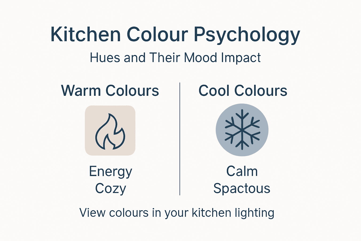
Colour psychology plays a significant role in kitchen design, with different hues capable of influencing mood and perception of space. Lighter colours can make a kitchen feel more spacious, while deeper tones create a sense of warmth and intimacy. The key is finding a balance that reflects your personal style while maintaining a professional and inviting atmosphere.
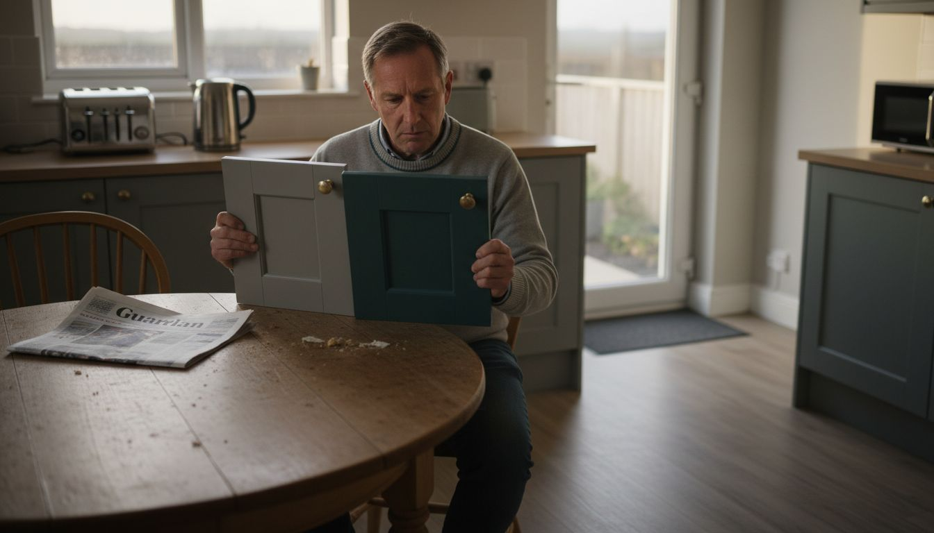
Pro tip: Before committing to a full kitchen colour scheme, always test colour samples in your actual kitchen space to understand how natural and artificial lighting will impact the final appearance.
Types of Colour Matching Techniques Used
Colour matching techniques offer homeowners multiple creative approaches to designing visually compelling kitchen spaces. Mix and match strategies have become increasingly popular, allowing for personalised and dynamic kitchen designs that move beyond traditional uniform colour schemes.
One prominent technique involves establishing a foundational neutral palette which provides flexibility for introducing accent colours. Designers often recommend starting with neutral tones like greys, beiges, and whites, which create a versatile backdrop for more expressive design elements. These neutral foundations allow for easier transitions and modifications in kitchen aesthetics over time.
Several distinct colour matching techniques emerge in contemporary kitchen design:
- Monochromatic Approach: Using varying shades and tones of a single colour family
- Complementary Colour Blocking: Strategically placing contrasting colours in specific zones
- Tonal Matching: Blending colours with similar undertones for a sophisticated look
- Material-Based Colour Integration: Coordinating colours through different textures and finishes
- Focal Point Technique: Selecting colours based on a dominant design element like worktops or splashbacks
The complexity of colour matching extends beyond simple visual appeal, requiring an understanding of spatial dynamics, lighting conditions, and psychological impacts of different colour combinations. Digital design tools have made experimenting with these techniques more accessible, allowing homeowners to visualise potential colour schemes before committing to a full renovation.
Here is a comparison of popular colour matching techniques used in kitchen design:
| Technique | Visual Effect | Level of Customisation | Ideal For |
|---|---|---|---|
| Monochromatic Approach | Subtle, elegant transitions | Moderate | Minimalist or modern kitchens |
| Complementary Colour Blocking | Bold, dynamic contrasts | High | Eclectic or statement designs |
| Tonal Matching | Cohesive, harmonious feel | Moderate | Sophisticated, timeless looks |
| Material-Based Integration | Layered textures, rich depth | High | Contemporary, tactile spaces |
| Focal Point Technique | Highlights key elements | Moderate to High | Feature splashbacks or worktops |
Pro tip: Create a mood board with physical colour swatches and material samples to better understand how different colours interact in your specific kitchen lighting and environment.
How Professional Colour Matching Works
Professional colour matching services represent a sophisticated approach to creating precisely tailored kitchen colour solutions. This specialised process goes far beyond selecting standard paint colours, involving advanced technological techniques and expert colour analysis to deliver bespoke aesthetic results that perfectly match client expectations.
The professional colour matching process typically involves several critical stages. Initial consultations allow designers to understand the client’s specific colour requirements, with customers often bringing physical colour references, paint swatches, or even personal items they want precisely matched. Spectrophotometer technology plays a crucial role, enabling professionals to capture exact pigment compositions with remarkable accuracy.
Key components of professional colour matching include:
- Detailed client consultation to understand colour preferences
- Advanced spectral scanning of provided colour samples
- Precise pigment formulation using computer-aided colour mixing systems
- Multiple sample iterations and client approvals
- High-resolution digital colour previews before final application
Advanced digital technologies have transformed colour matching, allowing unprecedented precision in reproducing exact colour shades. Professionals can now capture subtle colour nuances that traditional matching methods would miss, ensuring homeowners receive precisely the kitchen aesthetic they envision.
Pro tip: Always request multiple physical colour samples and view them in your kitchen’s actual lighting conditions before making a final selection.
Choosing the Right Colours for Respraying
Selecting the perfect colour for kitchen respraying requires careful consideration of multiple design factors beyond mere aesthetic preferences. Kitchen respray finish types play a crucial role in determining the overall visual impact and practical functionality of your kitchen space.
The choice of colour involves understanding how different shades interact with light, space, and existing kitchen elements. Colour psychology becomes paramount, with certain tones creating specific emotional responses and visual experiences. Warm neutrals, for instance, can create a sense of comfort, while cooler tones might introduce a more contemporary and streamlined feel.
Key considerations when selecting kitchen respray colours include:
- Evaluating natural and artificial lighting conditions
- Understanding the kitchen’s architectural layout and size
- Considering existing furniture and appliance colours
- Assessing personal style and long-term aesthetic preferences
- Examining current design trends and timeless colour options
Modern colour selection extends beyond simple visual appeal, incorporating sophisticated considerations of durability, maintenance, and spatial perception. Different finish types – from matte to high-gloss – can dramatically transform the kitchen’s appearance, with each option offering unique advantages in terms of light reflection, cleaning ease, and imperfection concealment.
Pro tip: Always test colour samples in your actual kitchen space at different times of day to understand how natural and artificial lighting will impact the final appearance.
Pitfalls and Common Colour Matching Mistakes
Common kitchen colour matching errors can dramatically undermine the aesthetic and functional appeal of your kitchen space. Homeowners often inadvertently create visual chaos by selecting colours without understanding their complex interactions, leading to design outcomes that feel disjointed and uncomfortable.
The most significant colour matching challenges stem from fundamental misunderstandings about how different hues interact within a confined space. Colour complexity requires careful consideration of multiple factors, including lighting conditions, surface textures, and the psychological impact of specific shade combinations.
Key colour matching pitfalls include:
- Introducing too many competing colour tones
- Neglecting the impact of natural and artificial lighting
- Failing to consider the kitchen’s architectural layout
- Choosing colours without testing samples in situ
- Ignoring the emotional and spatial effects of colour selection
Professional designers emphasise the importance of strategic colour placement, understanding that successful kitchen design is not about eliminating bold choices but about balancing them thoughtfully. Colour perception nuances play a crucial role in avoiding visual discord, with lighting and surface textures significantly influencing how colours are ultimately perceived.
The following table summarises common kitchen colour matching pitfalls and strategies to avoid them:
| Mistake | Main Impact | How to Avoid |
|---|---|---|
| Overusing multiple colour tones | Visual clutter | Limit palette to 2-3 key colours |
| Ignoring lighting conditions | Unpredictable appearance | Test samples in actual lighting |
| Choosing without reference samples | Unmatched final results | View swatches in kitchen setting |
| Forgetting spatial layout influences | Disjointed design | Consider flow and room function |
| Neglecting surface texture interactions | Colour distortion | Assess surfaces before selecting |
Pro tip: Create a comprehensive mood board with physical colour samples, and observe them in your kitchen’s actual lighting at different times of day to prevent unexpected colour interactions.
Perfect Your Kitchen Colour Matching with Expert Respray Services
The challenge of achieving flawless colour harmony in your kitchen is real. From balancing warm and cool tones to ensuring your chosen colours look stunning in natural and artificial light, the process can be overwhelming. If you want to avoid common pitfalls like visual clutter or mismatched shades, trust the professionals who understand advanced colour psychology and use precise matching technology. Our kitchen respray service offers a bespoke solution that brings your vision to life while respecting your space’s unique lighting and architecture.
Discover how our kitchen respray finish types can transform your space with expertly matched colours and finishes designed for longevity and style. Take the first step towards a harmonious kitchen by visiting SKR Specialists, where we respray kitchens in-situ to minimise disruption. Don’t wait let us help you create a visually cohesive and welcoming kitchen today with our professional colour match service tailored exactly for your home.
Frequently Asked Questions
What is colour matching in kitchen design?
Colour matching in kitchen design is a technique that involves strategically combining different hues and tones to create a visually harmonious kitchen space. This approach includes selecting a primary colour palette and introducing complementary secondary and accent colours that enhance the overall look and functionality of the kitchen.
How do I choose the right colours for my kitchen?
When selecting colours for your kitchen, consider factors like natural and artificial lighting, the kitchen’s architectural layout, existing furniture and appliances, and your personal style. Testing colour samples in your actual kitchen space at different times of day can help you understand how they will look under various lighting conditions.
What are common mistakes in colour matching for kitchens?
Common mistakes include introducing too many competing colours, neglecting the impact of lighting conditions, failing to test samples in the kitchen, and not considering how the kitchen’s layout affects colour choice. To avoid these issues, limit your palette to a few key colours and evaluate how they interact within the space.
What techniques can I use for effective kitchen colour matching?
There are several techniques for effective kitchen colour matching, including the monochromatic approach (using shades of a single colour), complementary colour blocking (using contrasting colours in specific areas), and tonal matching (blending colours with similar undertones). Each of these methods can create unique visual effects depending on your kitchen’s style and atmosphere.
Recommended
- 7 Kitchen Colour Scheme Ideas to Transform Your Home – WordPress
- Role of Colours in Kitchens – Transforming Space and Mood – WordPress
- How Colour Affects Kitchen Design: Complete Guide – WordPress
- Kitchen Colour Trends 2025: Transforming UK Homes – WordPress
- Maler Pris & Spørgsmål København – FAQ – Malerfirmaet BKA