")
How Colour Transforms Kitchen Space in England
Most british homeowners rarely realise how much kitchen colours shape their mood and daily routines. Studies show that over 80 percent of kitchen updates in England now focus on repainting or respraying instead of full renovations, reflecting a demand for affordable style transformations. Choosing the right palette inspires warmth, enhances function, and can make even older kitchens feel new. Discover practical colour strategies that truly work for british kitchens without expensive overhauls.
Table of Contents
- Understanding Colour Psychology In Kitchens
- Popular Kitchen Colour Schemes In Britain
- Psychological Impact Of Colour Choices
- Colour Effects On Space, Light, And Function
- Affordable Kitchen Respray Solutions
- Common Mistakes In Kitchen Colour Selection
Key Takeaways
| Point | Details |
|---|---|
| Colour Psychology Matters | Colour selections in kitchens not only enhance aesthetics but also influence mood and functionality. Understanding this can help create desired emotional atmospheres. |
| Consider Natural Light | The impact of lighting on colour perception is crucial; warmer tones can compensate for dim spaces, while cooler colours can thrive in well-lit areas. |
| Popular Trends | Embrace nuanced palettes that reflect contemporary trends, such as sage green and soft blues, which promote tranquillity and connection with nature. |
| Test Before Committing | Always test paint samples in your kitchen at different times of day to see how colours react to varying lighting conditions for the best result. |
Understanding Colour Psychology in Kitchens
Colour psychology represents a fascinating intersection between visual perception and emotional response, particularly within intimate home spaces like kitchens. Psychological research on colour interactions reveals that different hues can profoundly influence our mood, energy levels, and overall sensory experience.
In British kitchens, colour selection goes beyond aesthetic preference – it becomes a strategic tool for creating specific emotional atmospheres. Warm tones like soft yellows and gentle oranges can generate feelings of comfort and sociability, making the kitchen feel more inviting. Cool colours such as sage green and soft blue promote tranquillity and can make smaller spaces feel more expansive. Neutral palettes offer versatility, allowing homeowners to introduce accent colours through accessories or kitchen respray colour psychology techniques.
Understanding colour psychology requires recognising how different shades interact with natural and artificial lighting. A north-facing kitchen with limited sunlight might benefit from warmer, more saturated colours to compensate for reduced brightness. Conversely, kitchens with abundant natural light can experiment with cooler, more subdued tones without feeling clinical or unwelcoming.
Pro Tip: Before committing to a colour scheme, purchase small paint samples and observe how they look at different times of day to ensure the perfect kitchen atmosphere.
Popular Kitchen Colour Schemes in Britain
British homeowners have increasingly embraced sophisticated and nuanced colour palettes that reflect both contemporary design trends and timeless aesthetic sensibilities. Contemporary kitchen designs are moving beyond traditional white and neutral tones, with trending kitchen respray colour ideas offering innovative approaches to creating dynamic culinary spaces.
The most popular colour schemes in British kitchens currently blend practicality with emotional resonance. Sage green has emerged as a particularly beloved choice, offering a serene yet sophisticated backdrop that connects interior spaces with natural landscapes. Soft blues reminiscent of coastal environments provide a calming atmosphere, while muted greys continue to offer versatility and understated elegance. Deep navy tones have also gained significant traction, providing dramatic contrast and a sense of depth when paired with lighter cabinetry or worktops.
Regional variations play a fascinating role in colour selection across Britain. Northern kitchens tend to favour warmer, more saturated colours to counteract limited natural light, whereas Southern spaces might lean towards lighter, more reflective tones. Coastal regions often incorporate maritime-inspired palettes featuring soft blues, seafoam greens, and sandy neutrals that echo their surrounding landscapes. Urban kitchens in metropolitan areas like London frequently experiment with bolder, more contemporary colour combinations that reflect the dynamic energy of city living.
Pro Tip: Consider purchasing removable colour swatches and observing how different kitchen colours interact with your specific lighting conditions throughout the day before making a final selection.
Psychological Impact of Colour Choices
The psychological landscape of kitchen colour choices extends far beyond mere aesthetic preferences, representing a complex interaction between visual stimuli and emotional responses. Kitchen cabinet colour design insights reveal how specific colour selections can profoundly influence our psychological state, transforming culinary spaces from simple food preparation areas into emotional sanctuaries.
Warm colours like rich terracotta and soft yellows generate feelings of comfort and sociability, stimulating conversation and appetite. These hues create an inviting atmosphere that encourages family gatherings and relaxed interactions. Conversely, cool colours such as sage green and soft blue promote a sense of calm and cleanliness, making the kitchen feel more spacious and tranquil. Blues and greens are particularly effective in reducing stress, creating a serene environment that counteracts the often hectic nature of meal preparation.
Interestingly, neutral colours like white carry nuanced psychological implications. While frequently perceived as clinical, strategically implemented white spaces can actually enhance perceived cleanliness and create a sense of openness. When balanced with warmer accent colours or textural elements, white kitchens can feel simultaneously modern and welcoming. The psychological impact of colour extends to perceived room temperature – warmer tones can make a space feel more intimate, while cooler colours can create a sense of refreshment and spaciousness.
Here’s a summary of how popular kitchen colours impact emotion and functionality:
| Colour Type | Emotional Influence | Space Perception | Functional Benefit |
|---|---|---|---|
| Warm (yellows, terracotta) | Boosts comfort, encourages chatter | Feels cosier, more inviting | Stimulates appetite and creativity |
| Cool (sage green, soft blue) | Promotes calm, reduces stress | Makes kitchen feel larger | Enhances relaxation, cleanliness |
| Neutral (white, grey) | Evokes openness, modernity | Expands sense of space | Improves perceived hygiene |
| Deep (navy, charcoal) | Provides drama, depth | Creates intimacy and warmth | Suitable for large kitchens |
Pro Tip: Experiment with paint samples and observe how different colours interact with your kitchen’s natural light throughout the day before making a final colour commitment.
Colour Effects on Space, Light, and Function
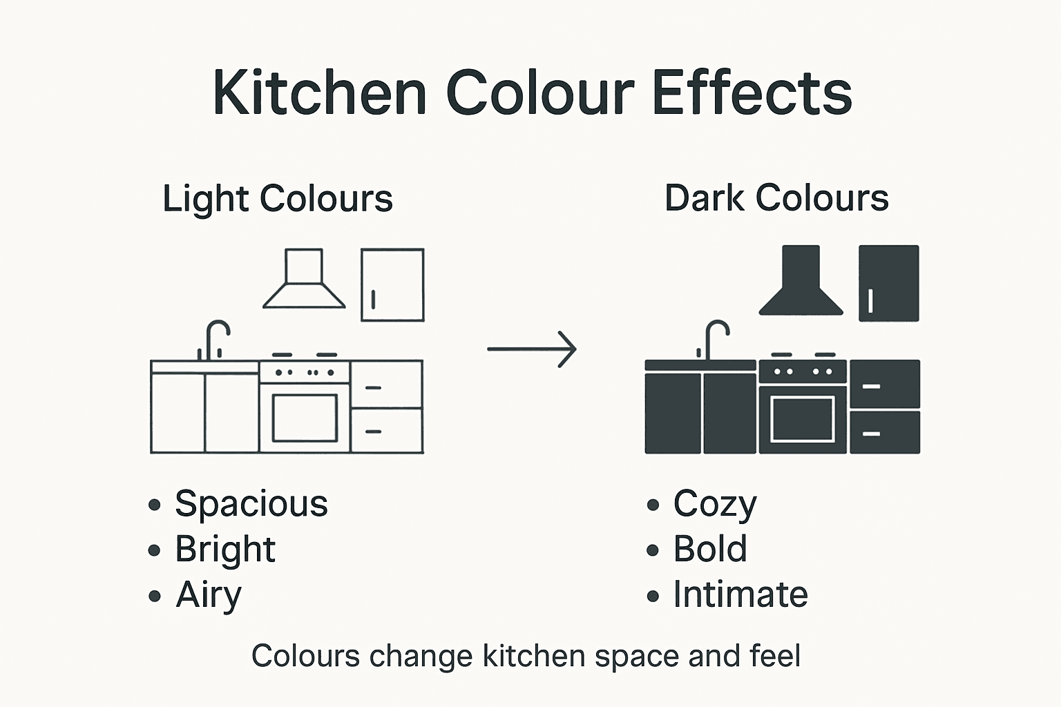
Colour selection is a powerful architectural tool that dramatically transforms kitchen spaces, influencing perceived dimensions, emotional atmosphere, and functional efficiency. Comprehensive kitchen design colour research demonstrates how strategic colour choices can visually manipulate spatial perception, making rooms feel larger, more intimate, or more dynamic.
Light colours, particularly soft whites and pale neutrals, create an illusion of expansiveness by reflecting more natural and artificial light. They can effectively make compact British kitchens feel significantly more spacious and airy. Conversely, deeper tones like charcoal grey or navy blue can create visual depth and intimacy in larger kitchen spaces, drawing walls inward and generating a sense of warmth. The interplay between colour and lighting is particularly crucial – warm-toned lights can enhance rich, saturated colours, while cool-toned lighting can provide a crisp, clean aesthetic.
The functional implications of colour choices extend beyond visual perception. Different colour temperatures can subtly influence kitchen workflow and mood. Energetic colours like vibrant yellows or oranges near food preparation areas can stimulate appetite and creativity, while calming blues and greens near dining spaces promote relaxation. The strategic use of colour can define work zones, create visual hierarchy, and support the kitchen’s multifunctional nature, transforming it from a mere cooking space to a comprehensive living area.
Pro Tip: Use large paint swatches and observe them at different times of day to understand how natural and artificial lighting will interact with your chosen colours.
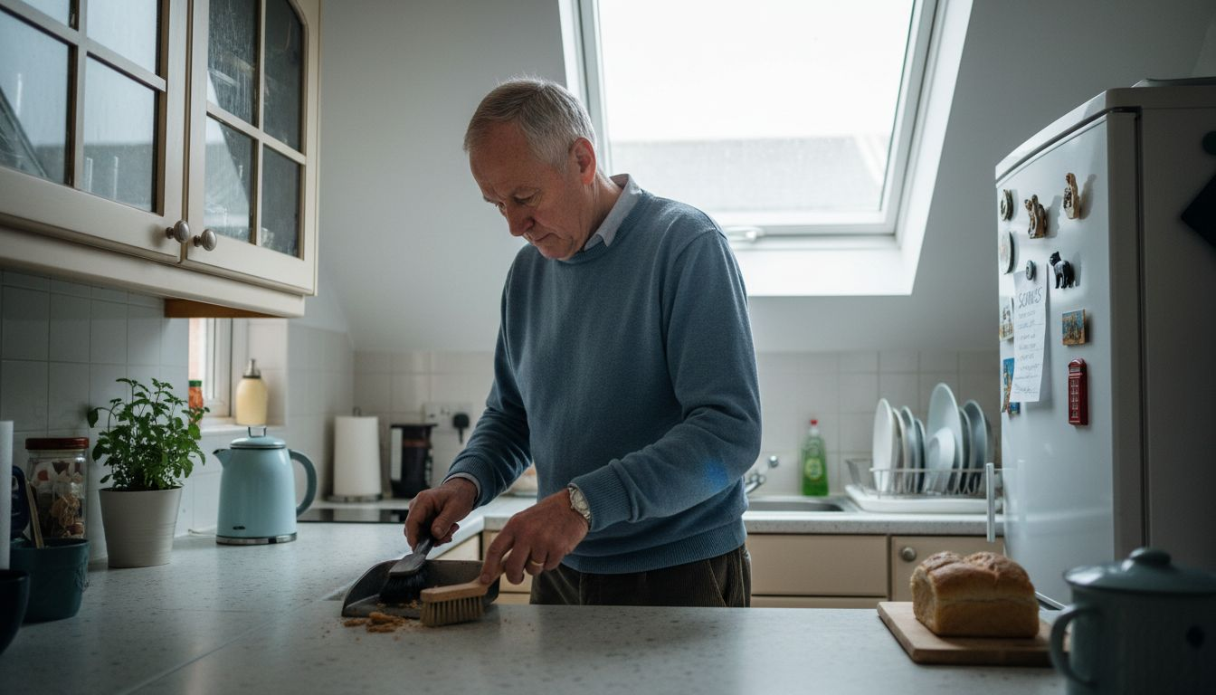
Affordable Kitchen Respray Solutions
Homeowners seeking budget-friendly kitchen transformations are increasingly turning to professional kitchen cabinet spray painting services as a cost-effective alternative to complete renovation. This approach offers significant savings, with prices typically ranging from £1,500 to £7,000, depending on kitchen size and complexity – dramatically less expensive than a full kitchen replacement.
The professional respray process involves meticulous preparation and application techniques that deliver exceptional results. Specialists carefully dismantle existing cabinetry, prepare surfaces through thorough cleaning and priming, and apply high-quality 2K topcoat paint using specialised spray equipment. This method ensures a factory-fresh finish that protects underlying surfaces while dramatically updating the kitchen’s aesthetic. The entire process minimises onsite disruption, allowing homeowners to transform their space without weeks of extensive renovation work.
Beyond cost savings, kitchen resprays offer remarkable versatility in design and functionality. Homeowners can dramatically change their kitchen’s appearance without structural modifications, selecting from an extensive range of contemporary colour palettes. Kitchen respray solutions also provide additional benefits like improved surface hygiene, enhanced durability, and the opportunity to address minor wear and tear that accumulates over years of use.
For quick reference, here are key differences between kitchen colour respray and full replacement:
| Aspect | Respray Solution | Full Replacement |
|---|---|---|
| Cost | £1,500–£7,000 | £10,000 or more |
| Disruption Duration | 3–5 days | 2–6 weeks |
| Design Flexibility | Wide palette, easy updates | Full customisation, structural change |
| Environmental Impact | Less waste, more sustainable | Higher material waste |
Pro Tip: Request colour samples and examine them under your kitchen’s actual lighting conditions to ensure the perfect match and visual impact.
Common Mistakes in Kitchen Colour Selection
British homeowners often fall into predictable traps when selecting kitchen colours, with the most critical error being a failure to understand how lighting fundamentally transforms colour perception. Interior design experts warn about the complexities of colour selection that can dramatically alter a room’s intended aesthetic.
One prevalent mistake is choosing colours in isolation, without considering the kitchen’s unique environmental context. Colours that appear perfect in a showroom or paint shop can look dramatically different under natural daylight, artificial evening lighting, or when positioned near specific materials like worktops and splashbacks. Warm-toned lights can introduce unexpected yellow or orange undertones, while cool-toned lighting might make colours appear more muted or grey. This colour metamorphosis means homeowners must test paint samples directly in their kitchen space, observing how the shade transforms throughout different times of day.
Another critical error involves neglecting the kitchen’s overall colour harmony. Many people select individual colours without considering how they interact with existing architectural elements, appliances, and furniture. A bold colour choice might clash with stainless steel appliances or wooden flooring, creating a disjointed and uncomfortable visual experience. Successful kitchen colour selection requires a holistic approach, understanding how different hues and tones communicate with each other and the surrounding environment.
Pro Tip: Create a comprehensive colour board with paint samples, material swatches, and photographs of your kitchen to visualise the complete colour ecosystem before making final decisions.
Transform Your Kitchen Colour Today for a Fresh New Look
Choosing the right kitchen colour in England can feel overwhelming with all the factors like natural lighting, emotional impact, and space perception at play. If you want to avoid common pitfalls such as mismatched tones or colours that change drastically in your kitchen’s lighting, professional respray solutions offer an ideal way to bring your vision to life. With expert knowledge of colour psychology and the latest trends, you can create a kitchen that feels spacious, welcoming and tailored to your lifestyle.
Discover the difference our professional kitchen respray service makes by visiting our landing page. We respray kitchens in-situ with minimal disruption and a wide palette of colours that perfectly align with your personal goals. For ideas and inspiration, explore our Uncategorized Archives – WordPress to learn more about colour transformations and practical tips. Don’t wait to refresh your kitchen space and uplift your home atmosphere. Start your colour journey now with SKR Specialists.
Frequently Asked Questions
How can colour influence the emotional atmosphere of my kitchen?
Colour plays a significant role in shaping the emotional atmosphere of a kitchen. Warm colours like yellows and oranges can create a welcoming and sociable environment, while cool colours like blues and greens promote calmness and tranquillity.
What colour schemes are currently trending for kitchens?
Popular kitchen colour schemes include sage green for its serene and sophisticated feel, soft blues that evoke coastal calm, muted greys for versatility, and deep navy tones for dramatic contrast and warmth.
How can lighting affect my kitchen’s colour choice?
Lighting can dramatically alter how colours appear in a kitchen. Warm lighting can enhance the richness of a colour, while cool lighting might mute it. It’s essential to test paint samples at different times of the day to see how they interact with both natural and artificial light.
What are the benefits of using neutral colours in kitchen design?
Neutral colours like white and grey provide versatility and can create an illusion of openness. When balanced with accent colours, they can enhance perceived cleanliness and modern aesthetic without feeling clinical.