")
Role of Colours in Kitchens – Transforming Space and Mood
Most british homeowners underestimate just how much colour affects a kitchen’s mood and functionality. A recent survey shows that over 60 percent of kitchen renovations in the United Kingdom now focus on bold new colour choices alongside practical updates. Understanding the psychology behind colour trends can help you create a kitchen that feels both beautiful and suited to daily life. This guide untangles how thoughtful colour respraying shapes kitchen atmosphere, supports well-being, and reflects current british design preferences.
Table of Contents
- Role of Colour Psychology in Kitchens
- Popular Kitchen Colour Trends in the UK
- How Colour Influences Light and Space
- Choosing the Right Colour for Respraying
- Common Mistakes to Avoid With Colour
Key Takeaways
| Point | Details |
|---|---|
| Impact of Colour on Mood | Different colours in the kitchen can influence emotions, such as calming blues or energising yellows. Selecting colours based on their psychological effects can enhance the kitchen environment. |
| Importance of Testing Colours | Always test paint samples in various lighting conditions to see how they change throughout the day. This can ensure that the final choice complements the existing kitchen features. |
| Current Colour Trends | UK homeowners are gravitating towards warm and expressive palettes, moving away from neutral tones. Two-tone designs can also add visual interest and sophistication. |
| Avoiding Common Mistakes | Neglecting lighting and existing architectural elements when choosing colours can lead to disjointed aesthetics. Understanding these factors is crucial for creating a harmonious space. |
Role of Colour Psychology in Kitchens
Colour plays a profound psychological role in kitchen design, transforming spaces beyond mere visual aesthetics. Understanding how different colours influence emotions and behaviour can help homeowners create environments that not only look beautiful but also support specific psychological needs and functional requirements.
Research indicates that kitchen colours significantly impact mood and perception. Colour psychology principles reveal specific emotional responses associated with different hues. White tones communicate cleanliness and spaciousness, creating an impression of larger, more hygienic environments. Blue shades introduce calming elements, helping reduce stress and improve mental focus during meal preparation. Green colours offer restorative qualities, while warm yellows energise the space and stimulate appetite.
The strategic selection of kitchen colours extends beyond aesthetic preferences. Warm neutrals create timeless, inviting atmospheres, whereas bold black accents can introduce luxury and sophistication. Psychological colour theory suggests that different areas of the kitchen might benefit from specific colour treatments. Cooking zones could incorporate energetic reds or oranges to stimulate activity, while dining areas might feature more soothing green or blue tones to promote relaxation and conversation.
Pro tip: When selecting kitchen colours, consider testing paint samples in different lighting conditions to understand how natural and artificial light transforms their psychological impact throughout the day.
Popular Kitchen Colour Trends in the UK
The United Kingdom’s kitchen design landscape is experiencing a vibrant transformation, with homeowners increasingly embracing bold and expressive colour palettes that reflect individual personality and contemporary design sensibilities. Emerging kitchen colour trends for 2025 demonstrate a significant shift from traditional neutral spaces towards more emotionally resonant and dynamic environments.
Contemporary British kitchens are gravitating towards warm, sophisticated colour schemes that create inviting atmospheres. Earthy and rich tones are dominating the design scene, with deep greens, navy blues, warm terracotta, and mocha emerging as standout choices. Homeowners are increasingly moving away from safe, minimalist colour palettes and embracing more expressive combinations that add depth and character to their cooking spaces. Two-tone designs are particularly popular, with combinations like navy and warm whites or dark and pale greys offering visual interest and stylistic complexity.
The colour trend spectrum is remarkably diverse, ranging from deeply saturated hues to soft, nuanced tones. Burgundy brings a sense of luxury, pale blue introduces tranquillity, and moss green offers a connection to nature. Playful accent colours like lilac and blush are being integrated to add sophistication and unexpected charm. These trends reflect a broader cultural shift towards creating kitchen spaces that are not just functional, but emotionally resonant and personally meaningful.
Here’s a summary of how popular kitchen colours can influence the environment and mood:
| Colour Group | Psychological Effect | Best Kitchen Application |
|---|---|---|
| Whites & Creams | Cleanliness, spaciousness | Small kitchens, minimalist designs |
| Blues & Greens | Calm, stress reduction | Dining areas, breakfast nooks |
| Yellows & Terracotta | Energy, appetite boost | Cooking zones, family kitchens |
| Deep Tones (Navy, Burgundy) | Sophistication, luxury | Accent walls, feature cabinets |
Pro tip: When exploring kitchen colour trends, consider sampling colours in your specific space and observing how natural and artificial lighting transforms their appearance throughout the day.
How Colour Influences Light and Space
Colour is a transformative element in kitchen design, possessing an extraordinary ability to manipulate perception, create visual depth, and fundamentally alter spatial experiences. Colour contrast principles reveal how strategic colour selection can dramatically influence how we perceive and interact with interior spaces.
Light and colour share an intricate relationship that goes far beyond simple aesthetic considerations. Lighter colours, such as soft whites and pale yellows, have remarkable light-reflecting properties that can make a kitchen feel more expansive and airy. Conversely, deeper tones like navy blue or forest green can create a sense of intimacy and depth, visually compressing spaces and generating a more intimate atmosphere. The strategic placement of colours can optically expand or contract a room, allowing designers and homeowners to manipulate spatial perceptions without structural modifications.
The interplay between colour and light involves complex visual dynamics. Surfaces with high-reflectivity colours bounce light around the room, creating a sense of openness and brightness, while matte or darker finishes absorb light, generating a sense of warmth and cosiness. Texture further complicates this interaction – glossy surfaces reflect more light, creating luminosity, whereas matte surfaces diffuse light, softening the overall visual experience. Understanding these nuanced interactions allows homeowners to craft kitchen environments that feel precisely calibrated to their emotional and functional requirements.
Pro tip: Use a large white poster board to test paint colours in your kitchen, observing how they interact with natural and artificial lighting at different times of day.
Choosing the Right Colour for Respraying
Selecting the perfect colour for kitchen respraying requires a nuanced approach that balances aesthetic preferences with functional considerations. Professional colour selection strategies reveal that successful colour choices extend far beyond simple visual appeal, encompassing complex interactions between light, space, and emotional atmosphere.
The process of choosing an ideal kitchen respray colour involves carefully evaluating multiple critical factors. Existing kitchen lighting plays a pivotal role in colour perception – natural daylight, overhead fixtures, and ambient illumination can dramatically transform how a colour appears throughout different times of the day. Homeowners should consider the kitchen’s architectural elements, including cabinetry materials, worktop surfaces, and surrounding wall colours, ensuring the new colour creates a harmonious and cohesive visual environment. Some professionals recommend creating sample boards or using digital visualisation tools to preview potential colour transformations before committing to a full respray.
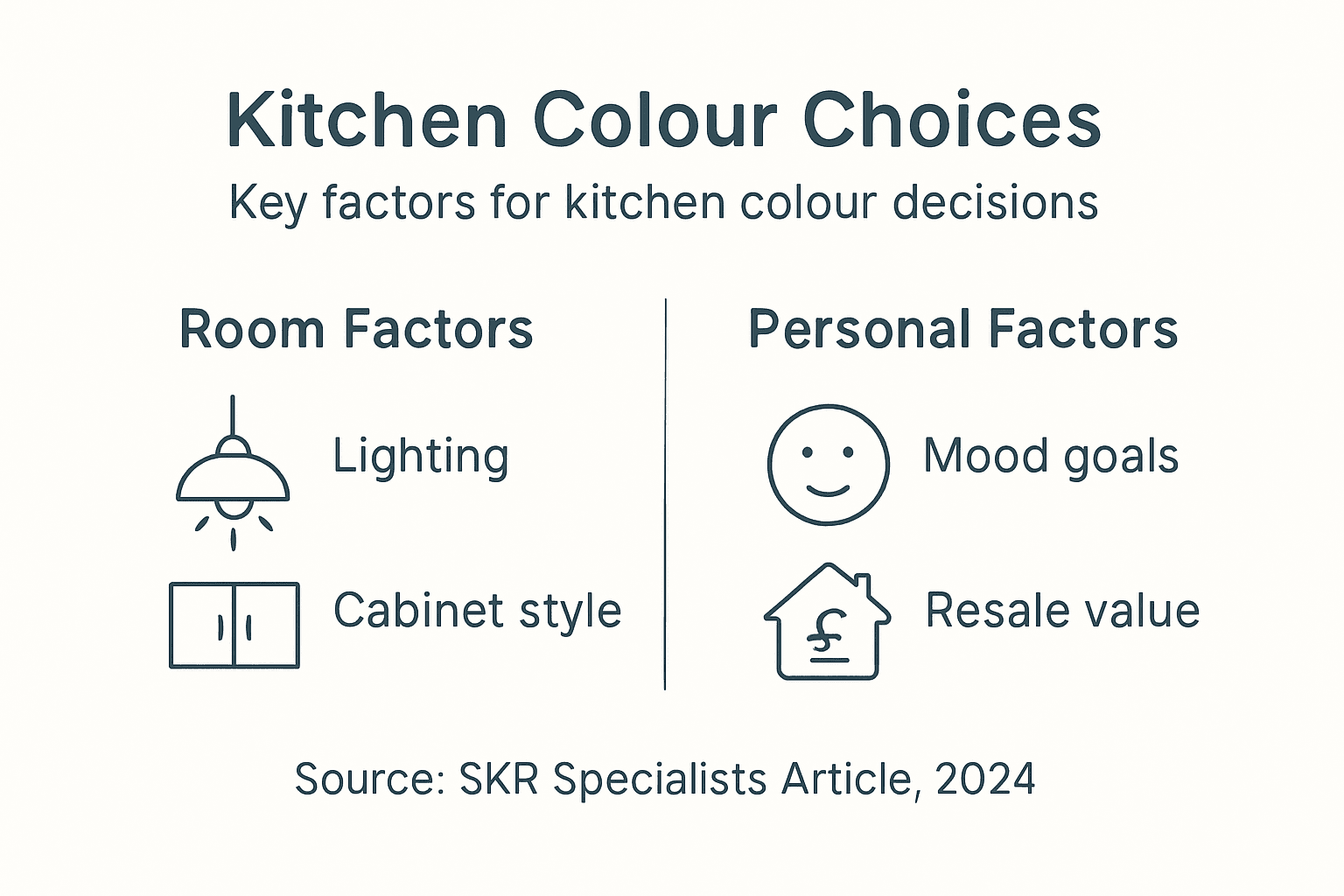
Contextual considerations are equally important when selecting kitchen colours. The overall architectural style of the home, the room’s natural light exposure, and the psychological impact of specific colour tones should guide decision-making. Warmer colours like terracotta and soft yellows can create inviting, energetic spaces, while cooler tones such as sage green or pale blue introduce a sense of calm and sophistication. The texture and finish of the respray can also significantly influence the colour’s final appearance, with matte, satin, and glossy finishes each offering unique visual and tactile experiences.
Pro tip: Always test colour samples directly in your kitchen under different lighting conditions, observing how they interact with existing surfaces and change throughout the day.
For guidance, here are key factors to consider when selecting a kitchen respray colour:
| Factor | Why It Matters | Example Impact |
|---|---|---|
| Lighting Type | Alters perceived colour depth | Daylight brightens pale hues |
| Cabinet Material | Affects colour compatibility | Wood tones suit warm palettes |
| Room Size | Shapes spaciousness feel | Dark shades suit large spaces |
| Finish Texture | Changes colour appearance | Matte softens bold colours |
Common Mistakes to Avoid With Colour
Choosing colours for kitchen respraying involves navigating a complex landscape of aesthetic and functional considerations. Many homeowners inadvertently make critical errors that can compromise the overall design and emotional impact of their kitchen space. Understanding these potential pitfalls is crucial for achieving a successful and harmonious colour transformation.
One of the most common mistakes is neglecting the critical role of lighting in colour perception. Natural and artificial light can dramatically alter how a colour appears, making it essential to test paint samples under various lighting conditions. Food safety colour guidelines highlight the importance of understanding colour interactions, reminding us that colour choices extend beyond mere aesthetics and can impact practical considerations like visual clarity and spatial perception.
Another significant error is failing to consider the psychological and emotional dimensions of colour selection. Homeowners often choose colours based solely on current trends or personal preferences without understanding how these colours might influence mood, appetite, and overall kitchen functionality. Colours that appear vibrant and energetic in a showroom might feel overwhelming or disruptive in a home kitchen. Moreover, neglecting the existing architectural elements, such as worktops, flooring, and cabinetry, can result in a disjointed and visually jarring environment. Successful colour selection requires a holistic approach that considers the entire spatial context, including natural light exposure, existing colour schemes, and the desired emotional atmosphere.
Pro tip: Create large colour sample boards and move them around your kitchen at different times of day to truly understand how lighting and surrounding elements influence colour perception.
Transform Your Kitchen Mood with Expert Colour Resprays
Choosing the right colour to transform your kitchen space can be challenging. The article highlights how colour impacts mood, light, and spatial perception, but many homeowners struggle to select and apply colours that truly enhance their environment. Whether you want to boost energy in cooking zones or create calm dining areas, understanding psychological colour principles alone is not always enough. Key pain points include managing how paint colours interact with natural and artificial light and ensuring cohesion with existing cabinetry and surfaces.
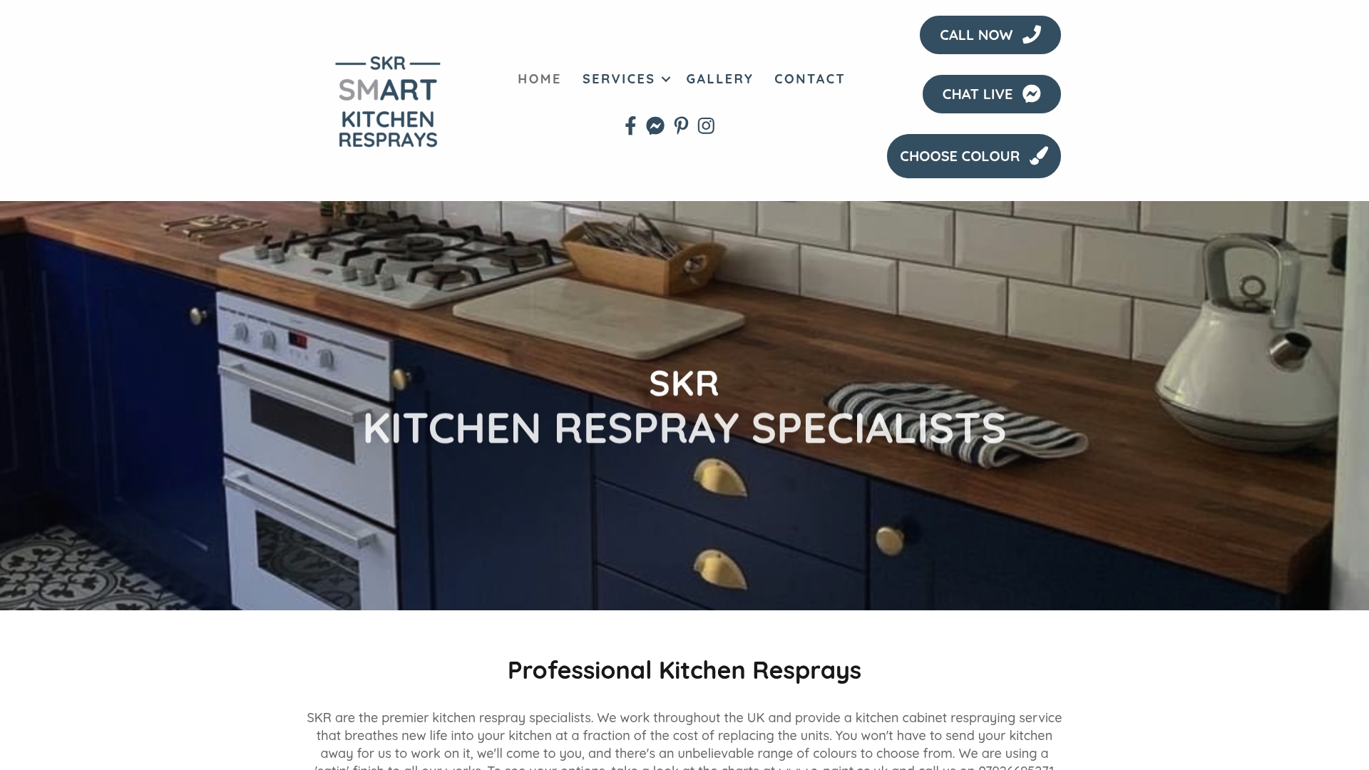
Our professional kitchen respray service at SKR Specialists specialises in bringing your ideal colour vision to life in-situ without needing a full renovation. We make it easy to explore popular and personalised colour trends while avoiding common mistakes like poor lighting compatibility or clashing finishes. Experienced with the subtle nuances of colour psychology and spatial dynamics, we help you create inviting, sophisticated kitchens that truly reflect your style and boost your well-being.
Explore our expert insights and project examples in the Uncategorized Archives – WordPress. Ready to see your kitchen transformed? Visit our homepage today and take the first step to a vibrant, mood-enhancing kitchen respray.
Frequently Asked Questions
How does colour psychology affect kitchen design?
Colour psychology plays a crucial role in kitchen design by influencing emotions and behaviour. Different colours can evoke feelings of calmness, energy, or appetite, helping to create an environment that enhances functionality and mood.
What are popular colour trends for kitchens in 2025?
In 2025, popular kitchen colour trends include warm earthy tones such as deep greens, navy blues, terracotta, and mocha. Homeowners are shifting towards bold, expressive combinations and two-tone designs for added visual interest and sophistication.
How can I choose the right colour for my kitchen respray?
To choose the right colour for kitchen respraying, evaluate existing lighting, architectural elements, and psychological effects of colours. Test colour samples under different lighting conditions and consider how the new colour will harmonise with existing surfaces.
What common mistakes should I avoid when selecting kitchen colours?
Common mistakes include neglecting the impact of lighting on colour perception, failing to consider the emotional effects of colour, and not harmonising colour choices with existing kitchen elements. A holistic approach helps ensure a successful colour transformation.
Recommended
- How Colour Affects Kitchen Design: Complete Guide – WordPress
- How Colour Transforms Kitchen Space in England – WordPress
- 7 Kitchen Colour Scheme Ideas to Transform Your Home – WordPress
- Kitchen Respray Colour Psychology: Complete Guide – WordPress
- 7 Modern Carpet Design Trends 2025 Homeowners Should Know – Yarra Valley Carpet Cleaning